DWC UI Improvement ideas
-
When I am using DWC on my Iphone, I find it frustrating that I cannot see the position and temp status of the machine unless im in status tab. when Im trying to move the gantry position around in the dashboard tab, i cant see the XYZ position at the same time.
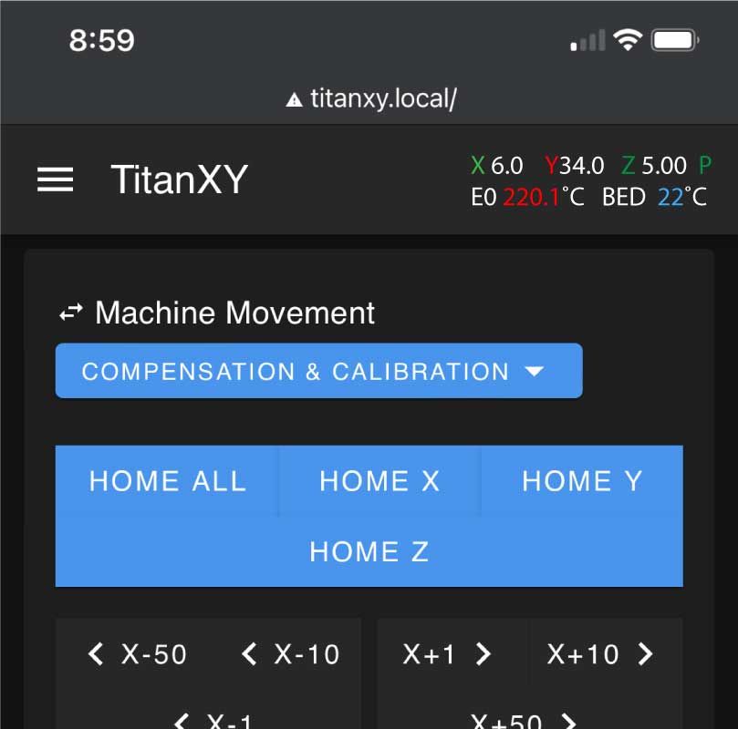
I wish it would have a small set of data shown in the header of all tabs
I have attached a quick mockup of the idea.Top row would should XYZ position, XYZP (P=Probe) letters would be color coded to represent endstop status. Green being untriggered and Red being Triggered
Bottom row would show Heater Status with Tool Heat and Bed Heat. With Red text if heater is on and Blue text if heater is off.

Hoping something like this can be implemented please
-
I'd like for the cancel and resume buttons to be further apart on mobile.
I can remember every long print that my filament sensors save and after loading more I go to resume printing but finger the button wrong because of finger size relative to button size or parallax between screen, eyes, and digitizer.