Height Map Padding
-
@bilagain said in Height Map Padding:
@ccs86 Please try either rolling your mouse wheel, left click and dragging or right click and dragging.
That is for manipulating the graphic.
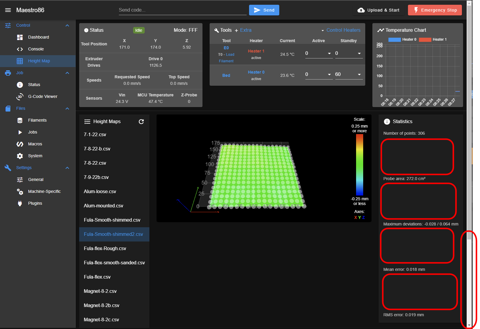
I'm talking about the whole graphic and statistics pane size. You can see the huge amount of padding between the stats. This causes the pane to be so big vertically that it needs a scroll bar.
-
@ccs86 Interesting. Gotcha. Figured you were asking based on the 'padding' around the graphic of the map.
What browser are you using?
-
@ccs86 one for @Sindarius
-
@ccs86
If there is no other solution, you can install the following plugin into the DWC to design the page yourself and even create your own buttons etc.GitHub link to Minty Trebor's BtnCmd
P.S.:
Have you tried different browsers?Google Translate
----- Original Text -----Wenn es keine andere Lösung gibt, dann kannst Du folgendes PlugIn ins DWC installieren um die Seite selber zu gestalten und sogar eigene Button etc zu erstellen.
GitHub Link zu BtnCmd von Minty Trebor
P.S.:
Hast Du verschiedene Browser ausprobiert ? -
@bilagain said in Height Map Padding:
@ccs86 Interesting. Gotcha. Figured you were asking based on the 'padding' around the graphic of the map.
What browser are you using?
Chrome
-
Even at more square aspect ratios, the padding pushes data off the screen:

-
@ccs86
Is this the latest DWC version ?
If yes... maybe a new installation will help, a repair, so to speak!?Google Translate
----- Original Text -----Ist das die aktuellste DWC Version ?
Wenn Ja... vielleicht hilft dann eine Neuinstallation, eine Reparatur sozusagen !? -
I'm on 3.4.1 right now. It has been this way for a long time though.
Are you saying that you don't see the same behavior?
-
@ccs86
I have never had such a graphical problem in the DWC before.
I use the Opera Browser and occasionally also the Microsoft Edge Browser.
With the Opera Browser, the mouse is always a little higher than the mouse pointer in full-screen mode, so I always have to click a little below icons etc., but that's only the case in full-screen mode.
The Edge Browser does not have this problem.
I don't use the Chrome Browser at all.
Perhaps you should try a different Browser to see if this graphical problem also exists there !?Google Translate
----- Original Text -----Ich hatte so ein graphische Problem im DWC bis jetzt noch nie.
Ich nutze den Opera Browser und zwischendurch auch den Microsoft Edge Browser.
Beim Opera Browser ist die Maus im Vollbild-Modus immer etwas höher wie der Mauszeiger, also muss ich dort immer etwas unterhalb von Icons etc klicken, das ist aber nur im Vollbild Modus so.
Der Edge Browser hat dieses Problem nicht.
Den Chrome Browser nutze ich gar nicht.
Vielleicht solltest Du mal einen anderen Browser ausprobieren ob dort dieses graphische Problem auch besteht !? -
Can you post a screenshot of what you see?
Edge browser looks exactly the same. Even with a non-wide aspect ratio:

-
@ccs86

Opera Browser / Fullsreen Mode / 100% Zoom
Opera Browser / Fullsreen Mode / 75% ZoomFound a mistake.
Your view in the browser is not at 100% -
If your browser is set to 100%, try setting it to over 100%.
It will then probably have something to do with the format of your monitor, since the resolution here may be much higher than normal !?Google Translate
----- Original Text -----Falls Dein Browser doch auf 100% stehen sollte, versuche mal über 100% einzustellen.
Es wird dann wohl mit dem Format Deines Monitors zutun haben, da hier die Auflösung eventuell viel höher ist als im Normalfall !? -
No change after changing the web page scaling.
My native resolution is 3440x1440, but I tried setting to 1920x1080 and the padding is still there.
I cleared any cookies and local storage for the DWC page. no change.
-

-
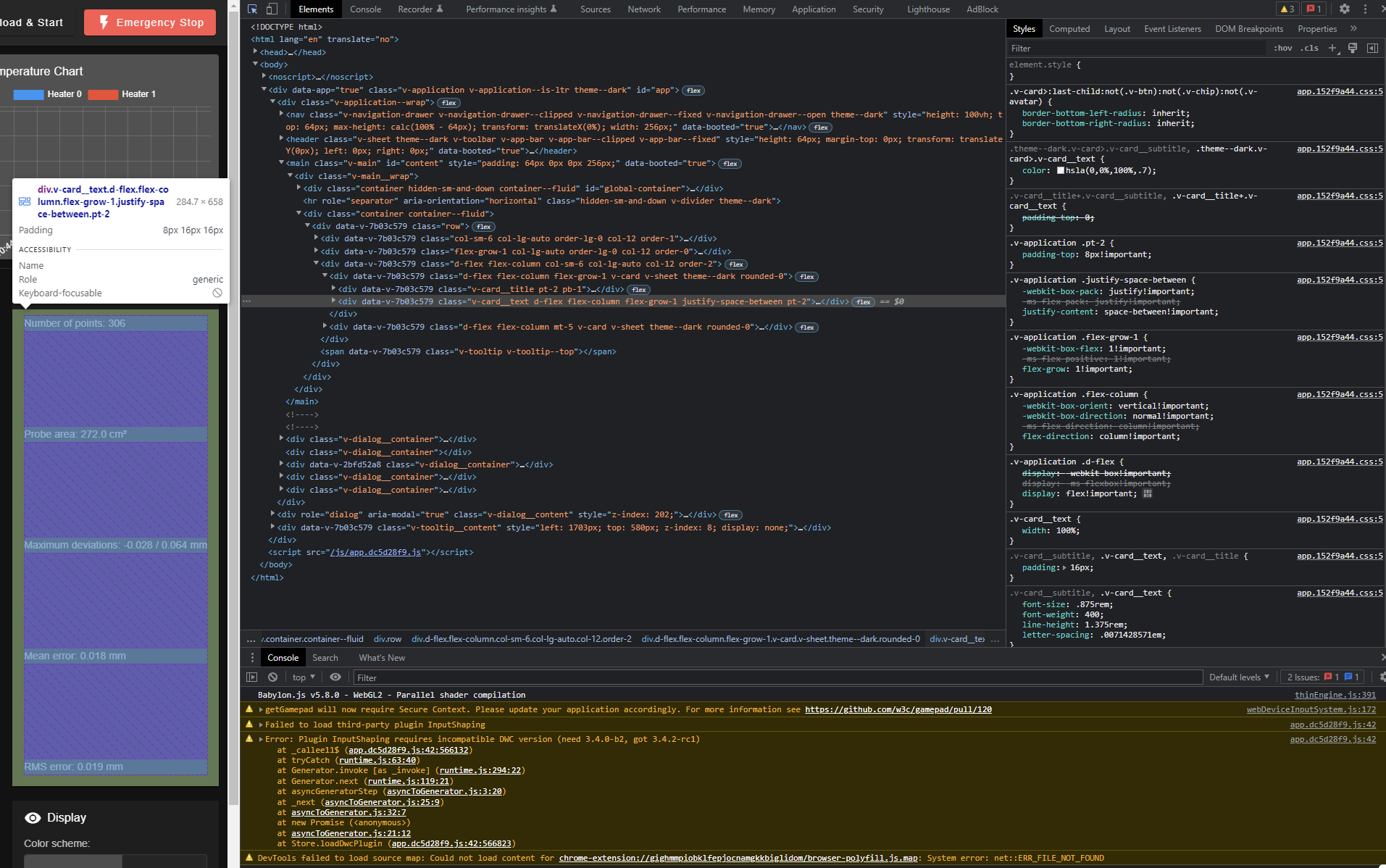
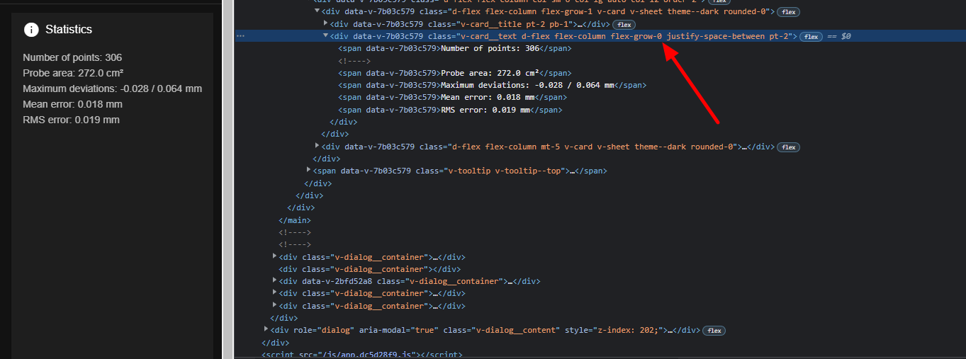
By changing this character to a 0, it collapses the text. This seems to show that the text is just trying to fill an over-sized pane:

-
Okay, I think I figured out what is going on:
- The statistics pane wants to scale vertically to match the height of the tallest pane
- The middle heightmap pane is set to a fixed aspect ratio, so when the window is in a very wide aspect ratio, the middle pane gets very tall and forces the statistics pane too tall
- The left pane which lists your saved height maps also auto scales height taller when the list gets long, so it can also force the statistics pane to be too tall
Screen recording that shows the issue dynamically:
2022-08-04-11-07-59.mp4I'm not sure what the cleanest solution is here. Maybe DWC could lookup the current monitor aspect ratio to decide which aspect ratio the height map pane should be.
It would also be nice if the height map list pane was scrollable itself, instead of autosizing and forcing the other panes to be too tall to fit.
-
@ccs86
if so then it's a case for @chrishamm who programmed the DWC, if I'm not mistaken. -
@norder it's an issue for @Sindarius as I mentioned previously as he programmed the height map plugin
-
@jay_s_uk I rewrote the 3D component of the heightmap plugin which replaced ThreeJS to BabylonJS which is used for the G-Code Viewer. It does come down to adjusting how the controls layout and resize in code.
-
@sindarius said in Height Map Padding:
@jay_s_uk I rewrote the 3D component of the heightmap plugin which replaced ThreeJS to BabylonJS which is used for the G-Code Viewer. It does come down to adjusting how the controls layout and resize in code.
Is that something you are able to change, or is it in the DWC code?