Ok, thank you @Phaedrux!
Posts made by elias
-
RE: PanelDue sharper iconsposted in PanelDue
Hi @dc42, I just remembered about this PR, have you had any time to take a look to it? Do you need me to do something else?
-
RE: PanelDue sharper iconsposted in PanelDue
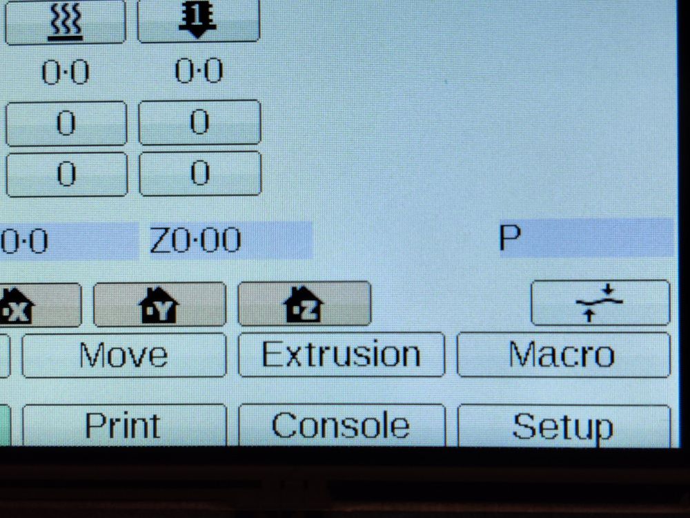
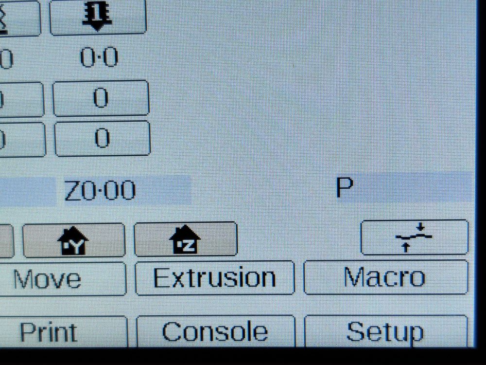
Here are some photos of the light theme, the first one is using the original icon set and the second one is using my modified icon set.
As you can see, here the icons show up some pixelation but it may be a good compromise for the improvement on the dark themes.
Thank you very much for your feedback.
-
PanelDue sharper iconsposted in PanelDue
Hi, I've being working during the last few days on, what I want to believe is, improving how the PanelDue behaves an looks and I would like to share it with you before going for a Pull Request.
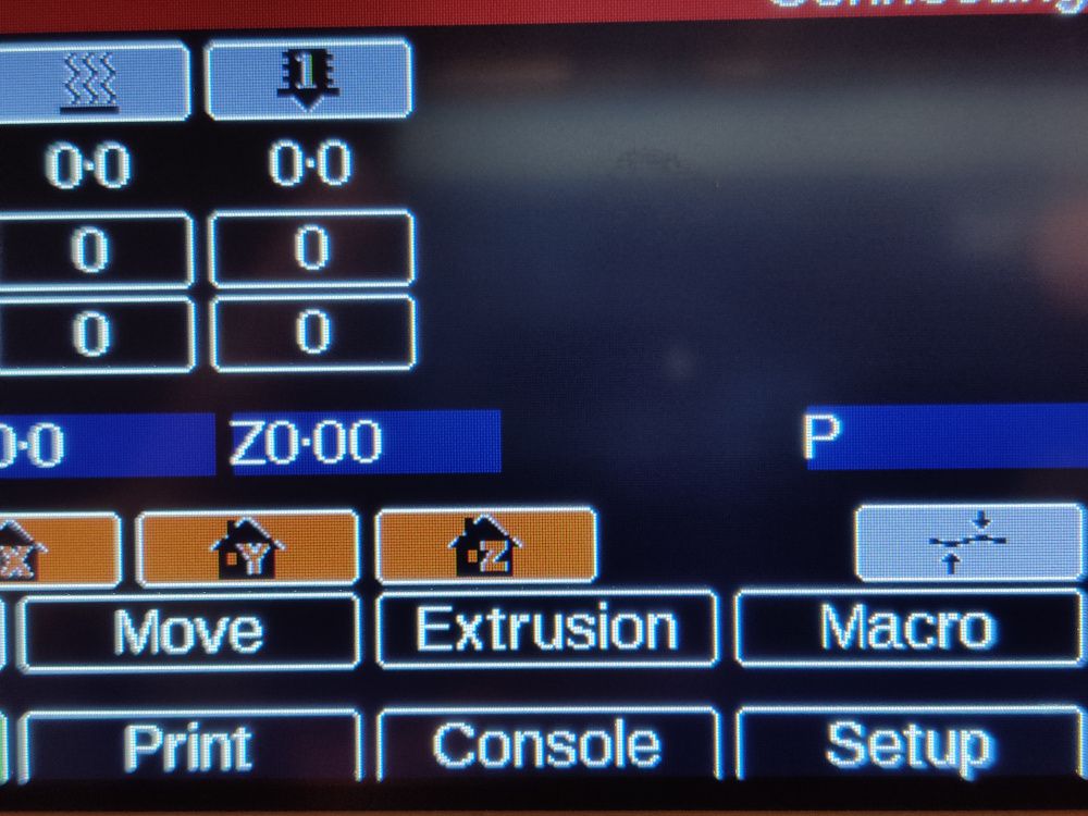
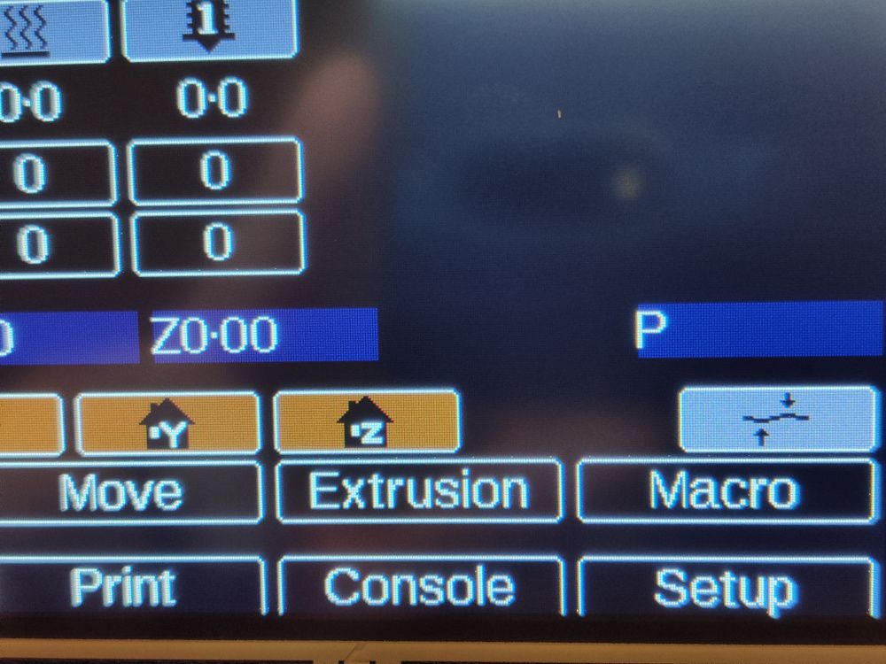
I always have being annoyed about how some of the icons look when a dark theme is used, they have white artifacts on the borders, due o original transparency turned into different shapes of white.
So I've edited every single image and sharpened (pixelated) all the borders. As I'm not good at graphic design, I have not being able to achieve the level I would like, but I thin the new set of icons I have come up with look much better, on average, fon all the different themes.
Here is an example of how icons looked before and after my changes:
P.S. As I was unable to find instructions on how to convert BMP icons to the indexed RGB565 format used on the source code, I also developed a very ruff but functional tool to do the conversion. If someone is interested on it I could share the source. It should work on any platform (WIndows, Linux, Mac), but I've only tested it on Linux.